9 Genius Charts That Let You Skip Cooking Math

If you really love cooking but don't particularly like the calculating part of it, here are 9 genius charts from the Huffington Post's food blog that let you skip cooking math. These nine cleverly-illustrated charts will help you figure out complex recipes, cooking conversions, alternative portions, and ingredients substitutions in a flash, making your entire cooking experience an enjoyable one. Thanks to "HuffPost Taste" and Campbell's who teamed up to bring you these charts, you'll never have to worry that your cooking measurements are off ever again.
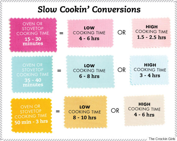
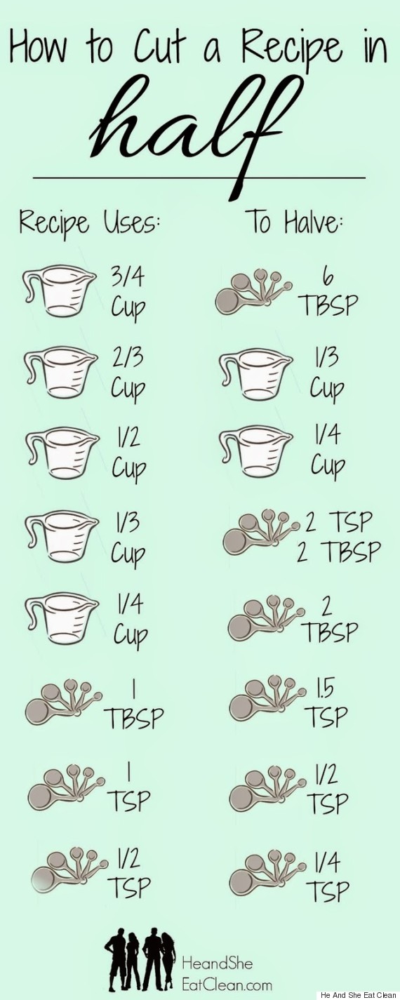
If you've ever tied your brain in knots by trying to figure half portions when you're cooking, fear not, you won't need to trouble yourself again. The first chart on the list is a halving chart, which gives you the full amount called for in any cooking recipe, then gives you the half amount as well � for example, three-quarters of a cup becomes six tablespoons, a third of a cup becomes two teaspoons and two tablespoons, and so on. Another great thing about this cooking halving chart is you can also go in the opposite direction � if you need to increase your quantity, then all you need to do is take it from half to full-sized. It's all there in full colour. You'll also find a cooking conversion chart here that will help you determine cooking time for slow cookers. Now you will be able to cook your slow-cooker recipes completely stress-free because all of the math has been done for you. This chart also works in reverse, so if you have a slow-cooker recipe that you'd like to cook fast, you can easily calculate the time involved.
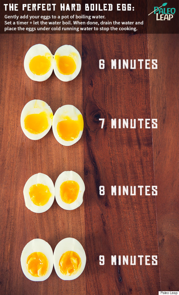
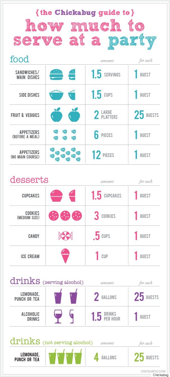
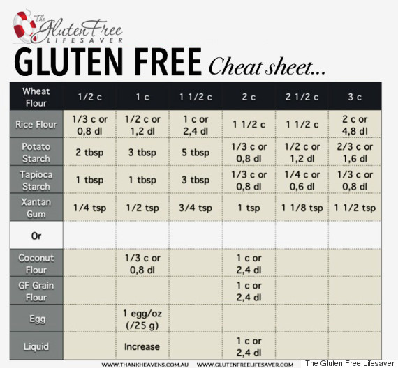
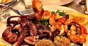
If you or someone in your family has a gluten sensitivity and requires a gluten-free diet, you don't have to give up all of your old wheat recipes after all � not with the �Gluten Free Cheat Sheet� that's included in this cooking chart list. It tells you exactly how much rice flour, potato starch, tapioca starch, or coconut flour to use as a replacement for white wheat flour, and it even gives you ideas for a few more substitutes that you might not have thought of before. This is a really handy one to print out and give to any of your friends and family who cannot digest wheat gluten. Another really helpful cooking chart listed here is the �Perfect Hard-Boiled Egg�. If you've always wanted to cook the perfect hard-boiled egg but have been having trouble getting the timing just right, then this is the answer to your prayers. This beautifully-illustrated chart shows you exactly how long to cook your egg � from soft-boiled egg to hard-boiled egg, and all of the boiled egg variations in between, this chart will guarantee the perfectly-cooked egg every time. You might want to invest in a cooking timer for this one. There's also a �How Much to Cook for a Party� chart here. This one can be invaluable if you are planning a gathering of some sort and are trying to determine how many sandwiches, side dishes, main dishes, appetizers, desserts, and drinks to make, and how many portions of each to provide for your guests. This way, you won't run out of anything � and you won't waste any food by making too much, either. These are just a few of the ingenious cooking math charts that you can find at the Huffington Post's food blog, �HuffPost Taste�. You might want to print them all out and hang them on the fridge so the next time you go on a cooking adventure and don't want to get lost, you will have the best maps to guide you to the best meal you've ever made.
Learn MORE / Get RECIPE at Huffpost Taste
To help with slow website load, we have put all photos for this article here: View photo gallery.